When using Elementor Page Builder, it’s common to use sticky header, especially if you are designing a landing page that works as a one-page site.
One-page sites have navigation menu items that auto-scroll users to the anchor links on the same page.
These are the links that start with a hashtag followed by the id (#id)
If the header is not sticky, it’s very easy to implement this by adding id attributes to each sub section and corresponding menu items with hashtags.
The tricky issue happens when you make the header “sticky”. Because this time you need to “offset” the auto-scroll amount to compansate the header’s height.
How to Use WordPress Playground For Testing a One-Page Website with Elementor
To demonstrate this, let’s implement a basic one-page site using WordPress Playground.
WordPress Playground runs WordPress entirely in the browser via WebAssembly. No server, no credentials, no setup required.
This allows you to test a plugin, theme, or any other feature quickly without need any domain or hosting account setup.
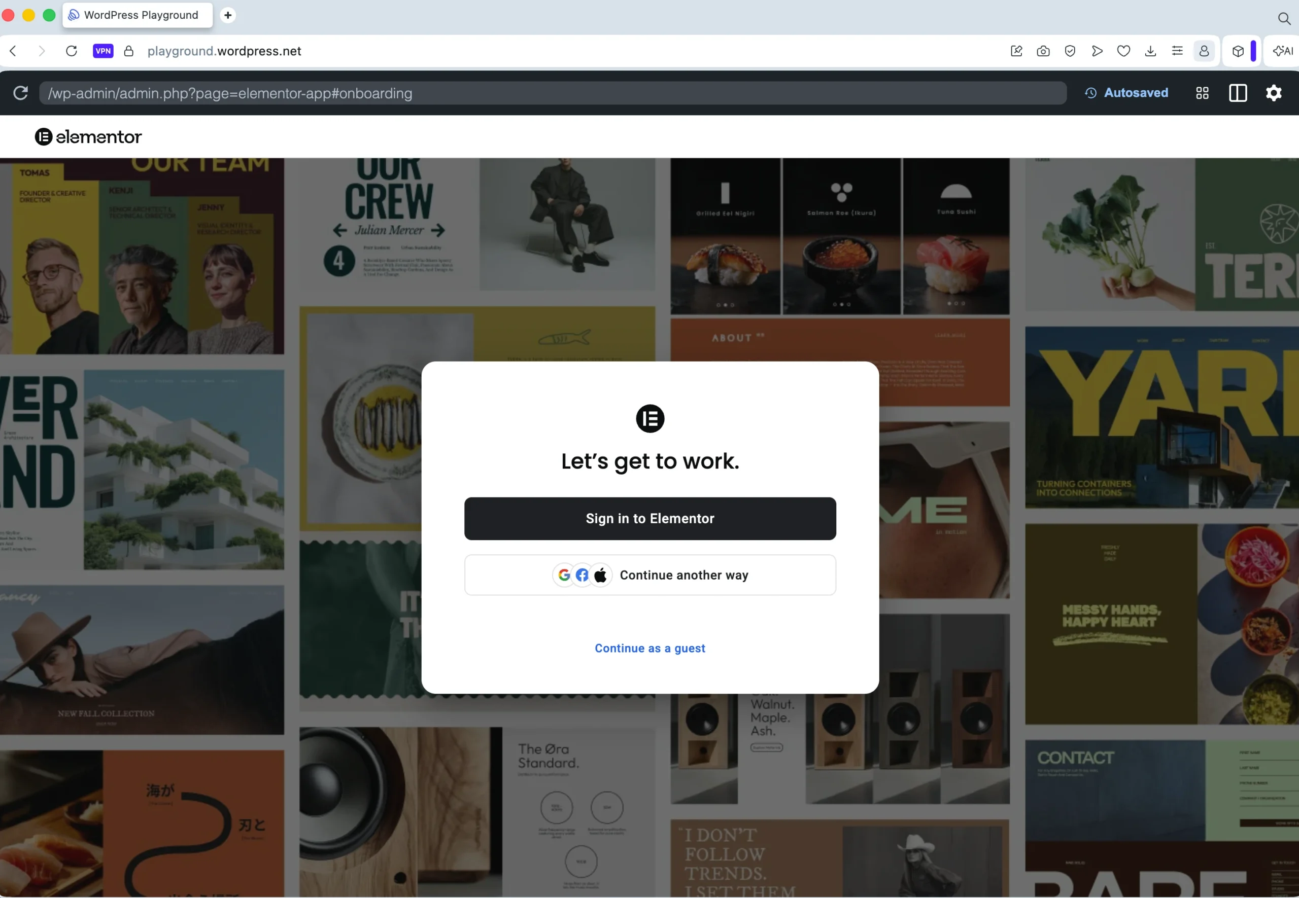
Skip Elementor’s default onboarding and continue as Guest.
The WordPress Playground link above auto installs Hello Elementor theme together with Elementor and Ultimate Addons for Elementor (which is required for navigation menu) in the free version.
How to Implement Sticky Header with Only CSS Using Elementor
To demonstrate the one-page site, simply add a few sections and rename the top most section as Header.

Navigate to Advanced > CSS Classes section and add sticky-header to the class list. Later, we will add Additional CSS to make the header sticky.
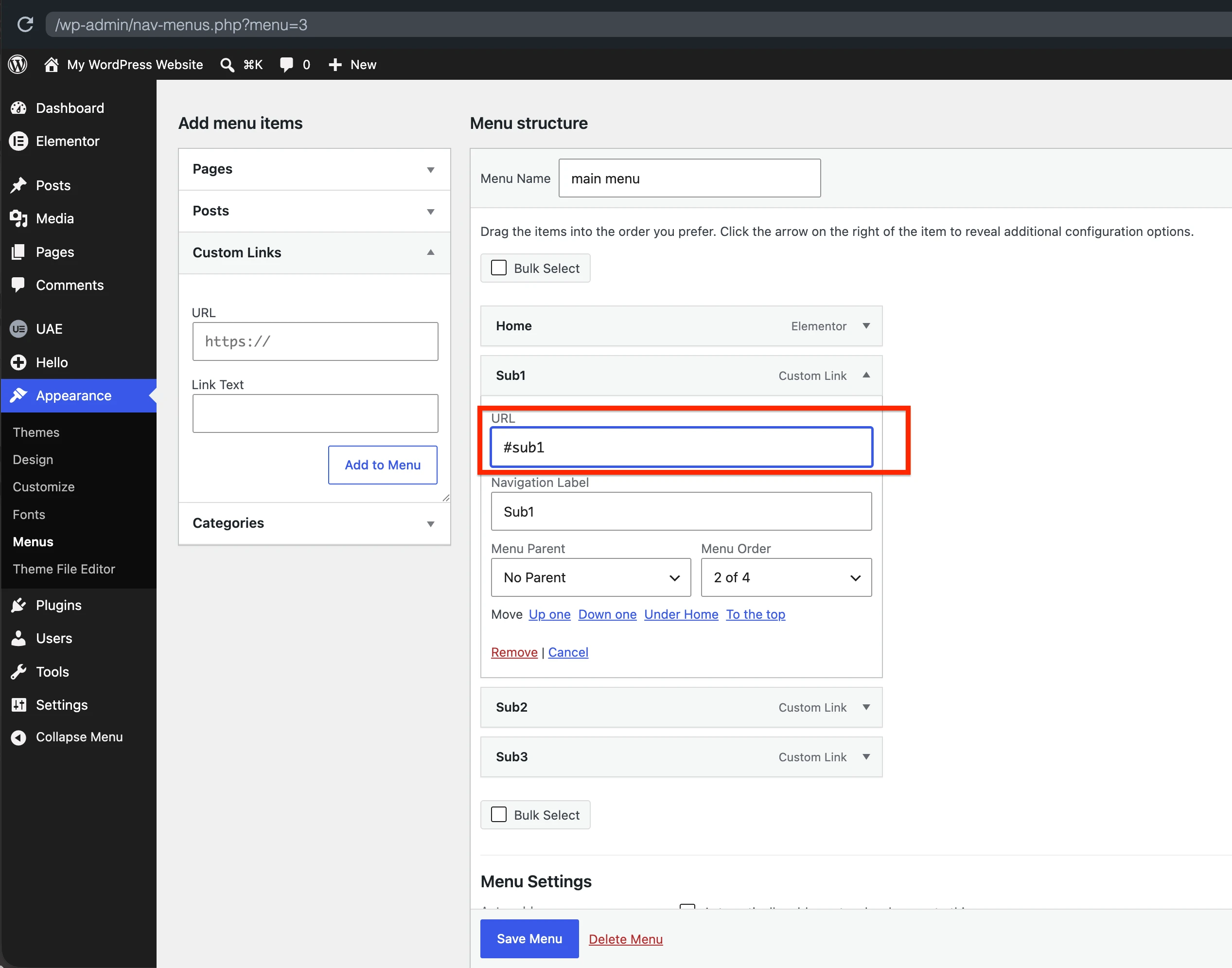
Next, navigate to Appearance > Menus. Create a new menu as seen in the screenshot with custom links to anchors on the same page (e.g. #sub1, #sub2, #sub3)
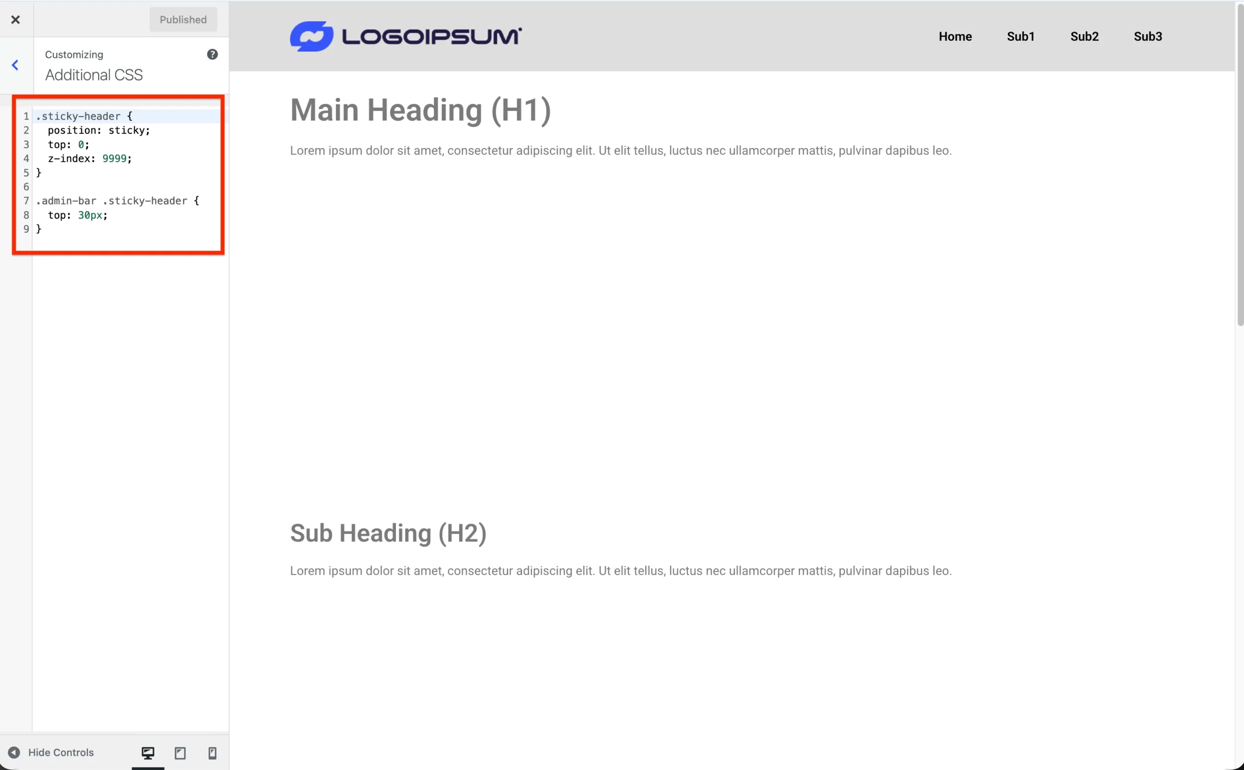
Next, navigate to Appearance > Customize and paste the following CSS styles to the Additional CSS textbox.
.sticky-header {
  position: sticky;
  top: 0;
  z-index: 9999;
}

// Add extra top space when logged in as admin
.admin-bar .sticky-header {
  top: 30px;
}
Your header section should now become sticky.
If you haven’t added sub sections, just add a few ones to increase the page height, so that you can test whether header “sticks” to the top when scrolling.
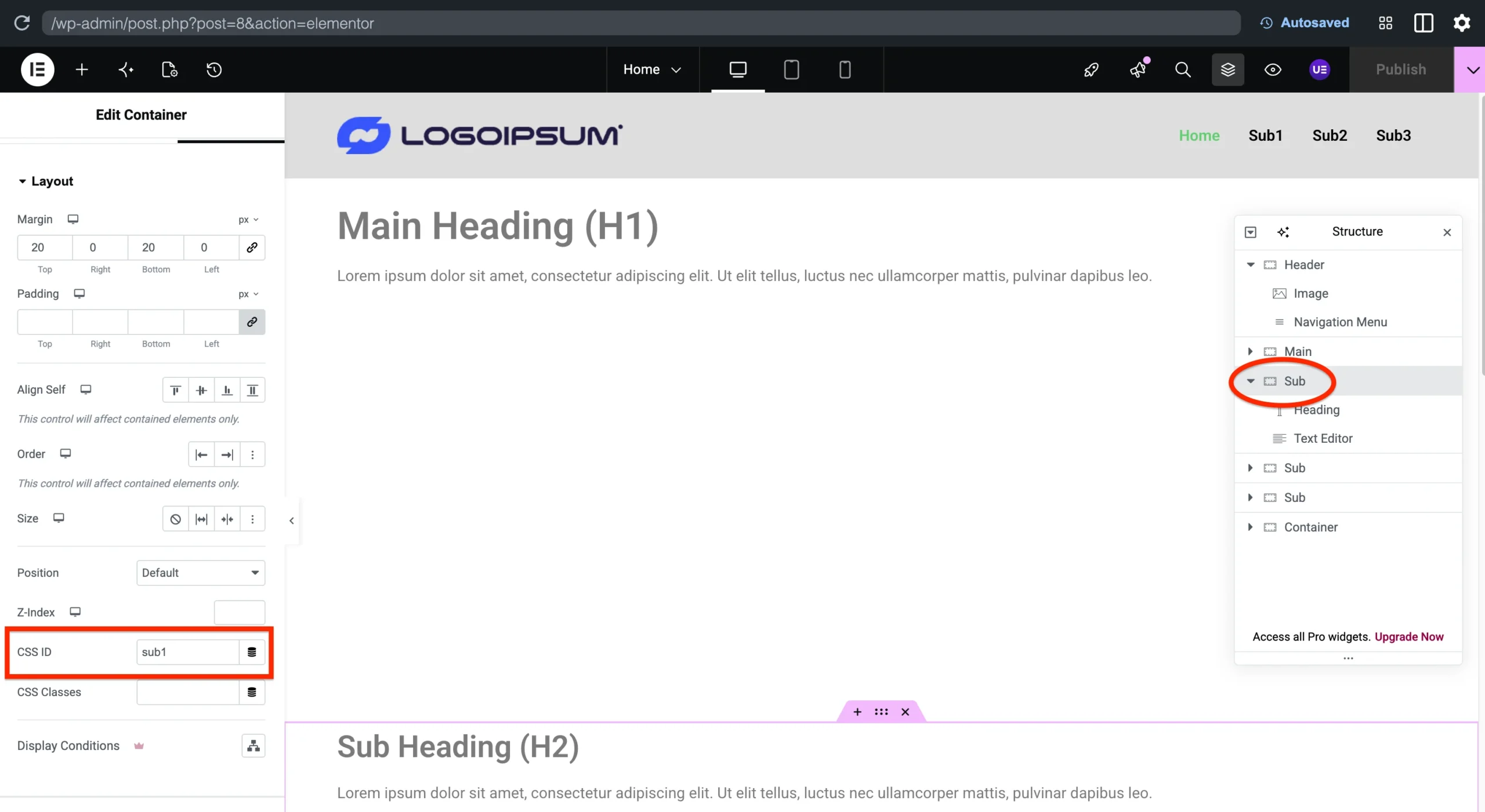
Finally, add the CSS IDs to the section headings to target them from the navigation menu items we added.
Why Sticky Header Needs Anchor Offset
If you have implemented the design features we have added so far, you should be able to click menu items and navigate between sub sections.
As you can see, when a sub heading is clicked, your browser scrolls the page until that heading is located at the top. But the sticky header stays above it.
Elementor (free version) doesn’t have a Menu Anchor widget that allows you to add scroll offset with a configurable height.
So, we need to add custom JavaScript to the end of the page in order to override the default behavior of Elementor and customize the offset height according to your custom header height for Desktop and Mobile views.
Add Custom JavaScript for Configuring Anchor Offset
In this final section of the tutorial, we will be adding HTML widget to the end of the page to implement Anchor Offset values to stop scrolling at a certain height from the top of the page.
This will help us avoid Headings to stay visible under the header.
Here is a short video after adding the custom JS.
Open your Elementor editor and add the following snippet to the bottom of the page using the HTML widget.
<script>
(function() {
  const SCROLL_OFFSET_DESKTOP = 150; // px to offset from top on desktop
  const SCROLL_OFFSET_MOBILE = 120; // px to offset from top on mobile
  const MOBILE_BREAKPOINT = 768; // px
  const SCROLL_DURATION = 800; // ms

  function getScrollOffset() {
    return window.innerWidth <= MOBILE_BREAKPOINT ? SCROLL_OFFSET_MOBILE : SCROLL_OFFSET_DESKTOP;
  }

  document.addEventListener('DOMContentLoaded', function() {
    document.addEventListener('click', function(e) {
      const link = e.target.closest('a[href*="#"]');
      if (!link) return;

      const href = link.getAttribute('href');
      const hashIndex = href.indexOf('#');
      if (hashIndex === -1) return;

      const targetId = href.substring(hashIndex + 1);
      if (!targetId) return;

      const targetEl = document.getElementById(targetId) ||
                        document.querySelector(`[data-id="${targetId}"]`) ||
                        document.querySelector(`.elementor-element[data-id="${targetId}"]`);

      if (!targetEl) return;

      // Stop Elementor's own scroll handler and default jump
      e.preventDefault();
      e.stopImmediatePropagation();

      closeMobileMenu();

      const targetPosition = targetEl.getBoundingClientRect().top + window.pageYOffset - getScrollOffset();

      smoothScrollTo(targetPosition, SCROLL_DURATION);

      // Update the URL hash without triggering another jump
      history.pushState(null, null, '#' + targetId);
    }, true); // capture phase, so this runs BEFORE Elementor's own bubble-phase listener
  });

  function closeMobileMenu() {
    // --- Universal detection: check if the mobile nav panel is actually visible on screen ---
    var navWidgets = document.querySelectorAll('.elementor-widget-navigation-menu');

    navWidgets.forEach(function(widget) {
      // The dropdown panel is a child <ul> or container inside the widget
      var navPanel = widget.querySelector('.hfe-nav-menu, ul[class*="nav-menu"]');
      if (!navPanel) return;

      var rect = navPanel.getBoundingClientRect();
      var style = window.getComputedStyle(navPanel);
      var isVisible = style.display !== 'none' &&
                       style.visibility !== 'hidden' &&
                       rect.height > 0 &&
                       navPanel.offsetParent !== null;

      if (isVisible && window.innerWidth <= 1024) {
        var toggle = widget.querySelector(
          '.hfe-nav-menu-icon, .hfe-nav-menu-icon-wrapper, [class*="menu-icon"], [class*="menu-toggle"], [aria-label*="menu" i], [aria-label*="toggle" i]'
        );
        if (toggle) {
          toggle.dispatchEvent(new MouseEvent('click', { bubbles: true, cancelable: true, view: window }));
        }
      }
    });

    // --- Attribute-based fallbacks (in case icon-specific markup does expose these) ---
    document.querySelectorAll('.hfe-nav-menu-icon-wrapper[aria-expanded="true"], .hfe-nav-menu-icon[aria-expanded="true"]').forEach(function(btn) {
      btn.click();
    });
    document.querySelectorAll('.hfe-nav-menu-icon-wrapper.toggled, .hfe-nav-menu-icon.toggled').forEach(function(btn) {
      btn.click();
    });

    // --- Classic Nav Menu widget ---
    document.querySelectorAll('.elementor-menu-toggle[aria-expanded="true"]').forEach(function(btn) {
      btn.click();
    });

    // --- Newer "Nav Menu" widget (Elementor 3.6+, e-n-menu) ---
    document.querySelectorAll('.e-n-menu-toggle[aria-expanded="true"]').forEach(function(btn) {
      btn.click();
    });
    document.querySelectorAll('.e-n-menu-heading[aria-expanded="true"]').forEach(function(btn) {
      btn.click();
    });

    // --- Hello Theme header (theme-native mobile menu) ---
    document.querySelectorAll('.site-header-mobile-toggle[aria-expanded="true"]').forEach(function(btn) {
      btn.click();
    });

    // Give click handlers a tick to run before checking fallback state
    setTimeout(function() {
      // Fallback: strip common "open" markers directly if click-through didn't close it
      var openSelectors = [
        '.hfe-nav-menu.toggled',
        '.hfe-nav-menu-wrapper.toggled',
        '.elementor-nav-menu--dropdown.elementor-active',
        '.e-n-menu.e--pointer-click.e-active',
        '.e-n-menu[data-open="true"]',
        '.elementor-active.elementor-nav-menu__container'
      ];
      openSelectors.forEach(function(sel) {
        document.querySelectorAll(sel).forEach(function(el) {
          el.classList.remove('elementor-active', 'e-active');
          el.removeAttribute('data-open');
        });
      });

      document.querySelectorAll('[aria-expanded="true"]').forEach(function(btn) {
        // Only touch elements that look like menu toggles, to avoid unrelated aria-expanded elements
        if (btn.className && /menu|toggle|hamburger|hfe/i.test(btn.className)) {
          btn.setAttribute('aria-expanded', 'false');
          btn.classList.remove('elementor-active', 'e-active', 'toggled');
        }
      });

      // Restore scroll lock
      document.body.classList.remove('elementor-nav-menu--dropdown-open');
      document.documentElement.style.overflow = '';
      document.body.style.overflow = '';
    }, 50);
  }

  function smoothScrollTo(targetY, duration) {
    const startY = window.pageYOffset;
    const distance = targetY - startY;
    let startTime = null;

    function animation(currentTime) {
      if (startTime === null) startTime = currentTime;
      const timeElapsed = currentTime - startTime;
      const progress = Math.min(timeElapsed / duration, 1);
      const ease = easeInOutCubic(progress);

      window.scrollTo(0, startY + distance * ease);

      if (timeElapsed < duration) {
        requestAnimationFrame(animation);
      }
    }

    function easeInOutCubic(t) {
      return t < 0.5 ? 4 * t * t * t : 1 - Math.pow(-2 * t + 2, 3) / 2;
    }

    requestAnimationFrame(animation);
  }
})();


</script>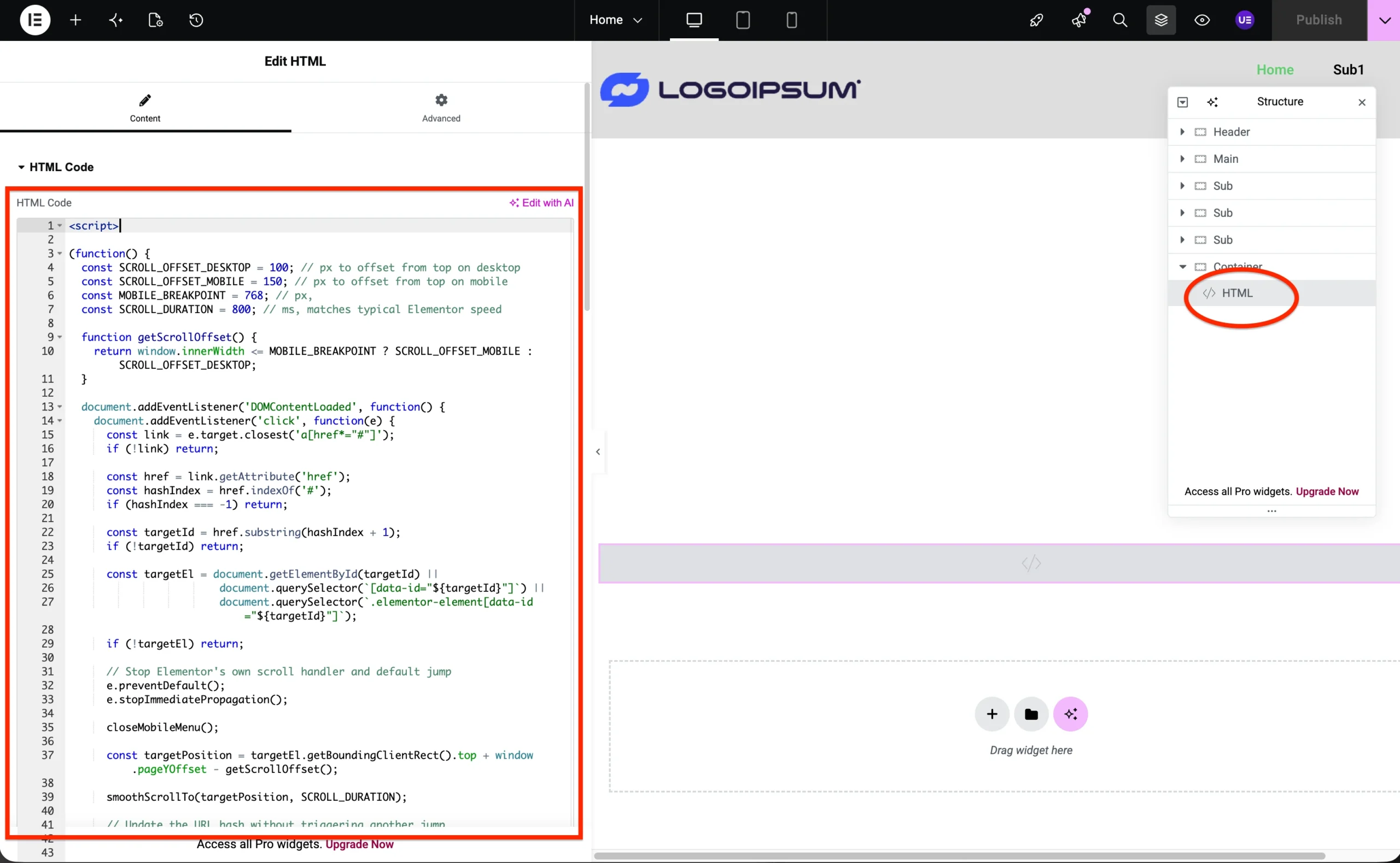
Adjusting the Offset Amount for Desktop and Mobile
At the top of the page you will see 4 constants:
- SCROLL_OFFSET_DESKTOP (pixels)
- SCROLL_OFFSET_MOBILE (pixels)
- MOBILE_BREAKPOINT (pixels)
- SCROLL_DURATION (miliseconds)
Change the default value of 150px for the SCROLL_OFFSET_DESKTOP according to your sticky header’s height.
Similarly change the value of SCROLL_OFFSET_MOBILE if your mobile header is shorter than the desktop header. This usually happens when you reduce the logo size for the mobile view.
Adjusting MOBILE_BREAKPOINT and SCROLL_DURATION are optional. These are self explanatory parameters. You can change the mobile breakpoint if needed and speed up or slow down the scrolling duration.
Additional Info
If you carefully go through the custom JS code we have added, there is a function closeMobileMenu()
When we override the default Elementor behavior, mobile menu stays open when you click an anchor link. This function fixes that and closes the mobile menu as soon as a menu item is clicked.
Why Use Ultimate Addons for Elementor (formerly Header Footer Elementor)
Free version of Elementor page builder doesn’t provide any widgets to make a section sticky, or add a WordPress navigation menu.
There are bunch of add on plugins that provide additional widgets including the navigation menu, but Ultimate Addons for Elementor plugin also allows you to imitate the Theme Builder functionality of Elementor Pro.
It also allows you to disable unused widgets to avoid loading of unnecessary code and reduce clutter in the Elementor Editor.
Conclusion
Using modern CSS, adding anchor offsets is actually very easy using one of the two methods below:
Global scroll padding for all anchor links
html {
  scroll-padding-top: 100px;
}Adjusting individual scroll margins
#elementor-section-id {
  scroll-margin-top: 100px;
}Unfortunately, default smooth scroll behavior of Elementor overrides both CSS and it requires custom JavaScript code to achieve the functionality we need.
Using target pseudo selector
There is a final solution I’ve seen when searching for the solution of this issue, which can be implemented with the following CSS Code.
:target {
  scroll-margin-top: 100px;
}However, this didn’t work in my case as well as the previous two CSS styles, even though I tried using the !important keyword.
If you need help implementing this Elementor trick, or similar visual tweaks and improvements, check out our Pricing page, or contact us for a free consultation with a WordPress expert.